Appearance
crudOptions.form
- 说明: 表单基本配置
- 类型: Object
- 支持: [el-form],[a-form]的配置
- 位置:
js
const crudOptions={
    form:{
        ...表单配置
    }
}- 支持:FsForm 的配置
调用FsFormWrapper组件实例的
open方法即可打开表单对话框。
此处的form会作为表单基本配置,分别与addForm、editForm、viewForm合并。
然后作为参数传入open对话框,从而打开不同mode的表单对话框
表单的字段布局伪代码
html
<el-form>
    <el-row class="fs-row">
        <el-col class="fs-col" v-for="item of columns">
            <el-form-item>表单字段</el-form-item>
        </el-col>
    </el-row>
</el-form>
对应ui库form的配置
js
const crudOptions = {
    form: { // crudOptions.form
        // 以下仅element,其他ui的相关配置请看对应ui的form组件文档
        labelPosition: "right", // 标签位置
        labelWidth: "100px", //标签宽度
        onXxxx: ()=>{}, //监听表单原始事件
        //... 更多配置请查看对应ui库文档,form表单章节
    }

}
display
- 说明: 表单布局方式
- 类型:String
- 可选:flex , grid
- 默认:flex
flex模式:通过
a-col/el-col分栏组件控制字段布局
grid模式:通过display:grid样式来控制字段布局
表单元素结构如下: 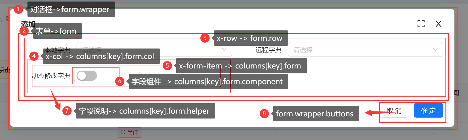
col
- 说明:
el-col|a-col配置 - 类型:Object
- 默认:
{span:12}一行显示两个字段,分两列布局(如果配置{span:24},则为单列布局)
row
- 说明:
el-row|a-row配置,可以配置gutter - 类型:Object
js
const crudOptions = {
    row:{
        gutter: 20 //form表单两列之间的间距
    }
}
formItem
- 说明: 表单下面字段
x-form-item的公共配置 - 类型:Object
js
const crudOptions = {
  form:{
      formItem:{
          labelCol: { // 演示antdv版设置label宽度
              style:{
                  // 配置label的宽度,并且超出部分隐藏
                    width: '100px',
                    overflow: 'hidden',
              }
          },
      }
  }
}
columns
- 说明: 字段列配置。(FastCrud初始化时会通过
crudOptions.columns.[key].form的配置自动生成,无需配置) - 类型:Object
- 示例:
js
const crudOptions = { //crudOptions.form.columns
  columnKey: {
    title: '字段名',
    component: {},
    rules: []
  }
}
initialForm
- 说明: 表单的初始数据,
- 注意:编辑时会与行数据合并,你还可以在字段中配置
columns.key.form.value=默认值 - 类型:Object
pasteKey
- 说明: 表单复制粘贴key
- 注意:用于在复制粘贴时,识别是从哪个表单复制粘贴的数据,相同的key的表单才能互相复制粘贴
- 类型:String
- 默认:
__default__
watch
- 说明: 表单数据监听,可以做实时计算
- 类型:
(context:FormScopeContext)=>void - 示例:
js
const crudOptions = {
    form:{
        watch({form}){
            //实时计算c=a+b
            form.c=form.a+form.b
        }
    }
}
beforeValidate
- 说明: 保存按钮后,表单校验之前触发,返回false或抛异常即可中止提交
- 类型:
async (context)=>void
beforeSubmit
- 说明: 表单提交前触发,,返回false或抛异常即可中止提交
- 类型:
async (context)=>void
doSubmit
- 说明: 提交表单时执行的方法(独立使用表单时,通过
formRef.submit()可触发此方法),返回false或抛异常即可阻止后续操作,比如阻止关闭窗口 - 类型:
async (context)=>void - 默认:默认无需配置,通过
useCrud自动生成
afterSubmit
- 说明: 表单提交后触发,可以弹出成功提示等,返回false或抛异常即可阻止后续操作,比如阻止关闭窗口
- 类型:
async (context)=>void - 示例:
js
const crudOptions = {
    form:{
        afterSubmit({mode}){
            if (mode === "add") {
                notification.success({ message: "添加成功" });
            } else if (mode === "edit") {
                notification.success({ message: "保存成功" });
            }
        }
    }
}
onSuccess
- 说明: afterSubmit没有抛异常且没有返回false时触发,默认为刷新表格
- 类型:
async (context)=>void - 默认值:
js
const crudOptions = {
    form:{
        onSuccess({mode}){
            crudExpose.doRefresh()
        }
    }
}
group
- 说明: 表单字段分组配置
- 类型:Object
- 示例: antdv-collapse | antdv-tabs | element-collapse | element-tabs
js
crudOptions.form = {
  // crudOptions.form
  group: {
    groupType: "collapse", // 可选值:tabs collapse
    //or tabs
    // 此处支持:el-collapse / a-collapse / el-tabs / a-tabs 参数
    accordion: true,
    //手风琴模式
    groups: {
      base: { //分组key,可随意命名
        show: true, //是否显示该分组
        // 该分组包含的字段keys
        columns: [
          'columnKey1',
          'columnKey2'
        ]

      }
    }
  }
}
group.groupType
- 说明: 表单分组组件类型
- 类型:String
- 默认:collapse
- 可选值: collapse,tabs
group.groups
- 说明: 分组配置
- 类型:
Object:{[groupKey]:Object}
js
crudOptions ={
  form:{
    group:{
      groups:{
        groupKey: {
          show: true, //是否显示该分组
          collapsed: false, //是否默认折叠
          //分组key,可随意命名
          // 此处支持el-collapse-item,el-tab-pane,a-collapse-panel,a-tab-pane
          title: "标题", //el-collapse-item参数
          label: "标题",  //el-tab-pane参数
          header: "标题", // a-collapse-panel 参数
          tab: "标题",// a-tab-pane 参数
          slots: {
            //插槽,可以自定义标题
          },
          //当前分组下的所有字段的col配置
          "col": {
            "span": 12
          },
          columns: [
            'columnKey1',
            'columnKey2'
          ]
          //该分组包含的字段keys
        }
      }

    }

  }
}
wrapper(表单容器,dialog/drawer)
- 说明: 表单容器配置的配置(
对话框dialog或抽屉drawer) - 类型:Object
wrapper.is
- 说明: 确定表单容器组件
- 类型:String
- 默认:el-dialog / a-modal
- 可选:el-dialog / el-drawer / a-modal / a-drawer
对应ui库对话框或抽屉组件的参数
- 说明: 对话框或抽屉组件的参数,比如宽度、样式、高度、标题等,具体参数请前往对应ui库的文档查找相应组件的配置
- 支持: 支持fs-form-wrapper,el-dialog,el-drawer,a-modal,a-drawer的配置,取决于wrapper.is配置
- 示例:
js
const crudOptions = { //crudOptions
  form: {
    wrapper: {
      width: '800px', //antdv对话框的宽度
      onXxxx: ()=>{}, //监听对话框或抽屉组件的原始事件
      //....更多 fs-form-wrapper,el-dialog,el-drawer,a-modal,a-drawer的配置
    }
  }
}
wrapper.draggable
- 说明: 是否支持拖拽
- 类型:boolean
- 默认:true
wrapper.title
- 说明: 对话框标题
- 类型:string
- 注意: 需要在editForm/viewForm/addForm下的wrapper中配置,否则无效
wrapper.buttons
- 说明: 对话框按钮配置
- 类型:object
- 更多:按钮组配置
js
const crudOptions = {
  form:{
    wrapper: {
      buttons: {
        ok: { //保存
          // fs-button配置
        },
        cancel: {}, //取消
        reset: {}, // 重置
        copy:{show:true} // 复制
        paste:{show:true} // 粘贴
      }
    }
  }
}
wrapper.contentProps
- 说明: 对话框内容组件的props(naive 比如抽屉组件的closable参数)
- 类型:object
- 示例:
js
const crudOptions = {
  form:{
    wrapper: {
      contentProps: {
        closable: true,
      }
    }
  }
}
wrapper.onOpen
- 说明: 对话框打开事件处理方法
- 类型:Function
wrapper.onOpened
- 说明: 对话框打开完成事件处理方法
- 类型:Function
wrapper.onClosed
- 说明: 对话框关闭事件处理方法
- 类型:Function
wrapper.saveRemind
- 说明: 表单有修改时是否提示保存,如果配置为一个方法,那么你可以自定义提示框,返回true表示需要保存,将自动保存后关闭对话框,返回false则表示不需要保存
- 类型:
boolean|()=>Promise<boolean> - 默认:true
wrapper.saveDraft
- 说明: 添加对话框是否开启自动草稿功能,关闭对话框时自动保存草稿,下次打开添加对话框自动加载草稿,免丢失数据
- 类型:
boolean - 默认:false